Vroom - Native AppsDefect Disclosure + Product Page Redesign
Mapping out flowsWhere We Started
At the end of 2019, Vroom launched both of their native apps projects, which started to port over most of the search and catalog features from the original website to help more users find vehicles. This product page had not been tested on app users before, so we wanted to make sure it was optimized. We also knew there were multiple new features we would need to build into the apps, so with this consideration we began a re-vamp of the product pages.
Some of the features we knew were coming soon:
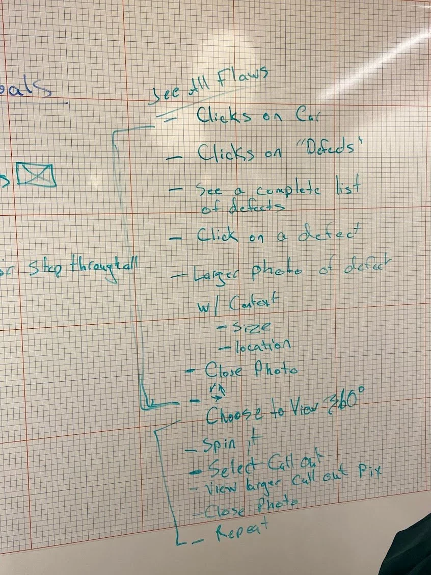
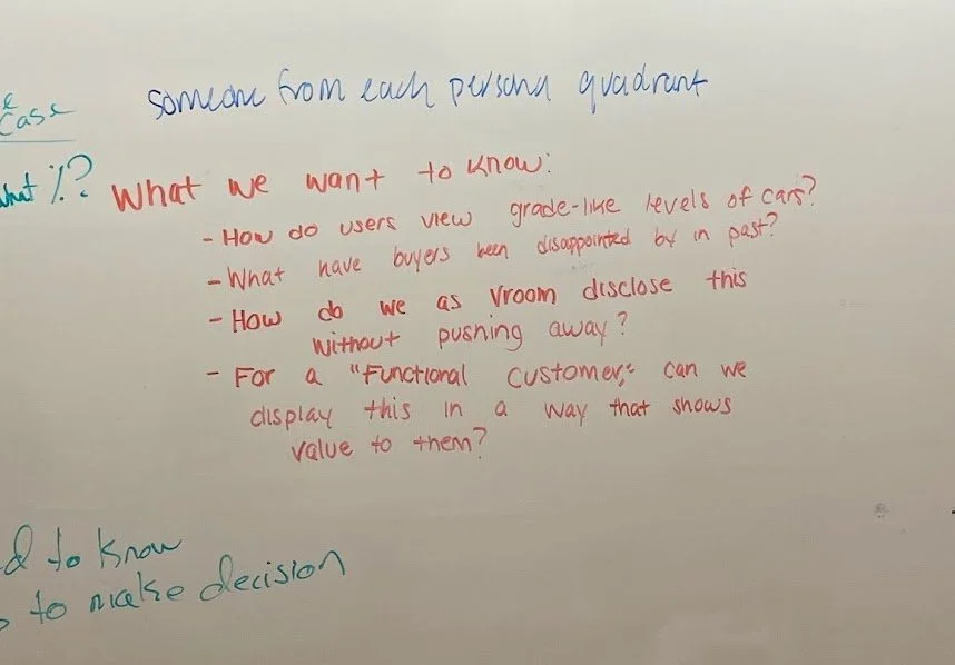
Defect disclosure (showing users what small defects were on vehicles that Vroom was not going to fix)
360 view of vehicle
Shipping Location (would come much later)
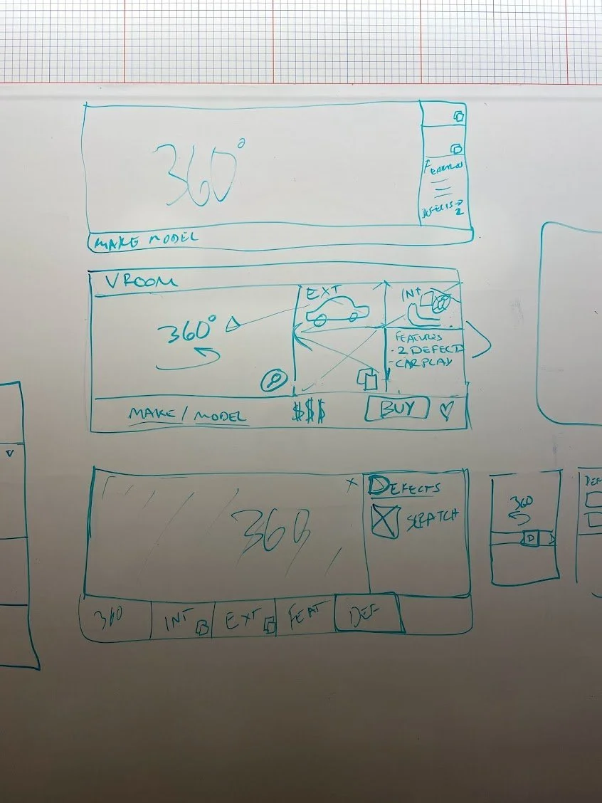
Understanding what we know about vehicle defectsWire-framingMore Research
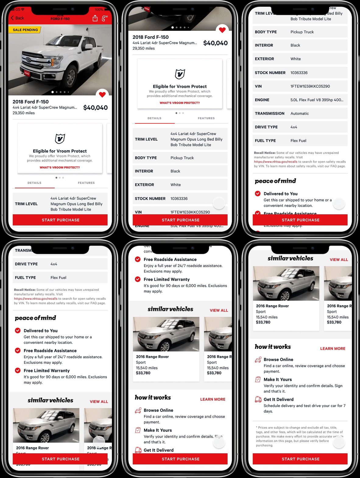
In order to condense the visual clutter on the product detail page and make room for any new features we wanted to add, we conducted interviews to determine what kind of information users were looking for when purchasing cars. From here we condensed this information down and decided on some pieces to test removing on the app product detail page versus the website’s.
Then, I conducted a cart sort project to understand what information was the most important to users.
Some insights:
People love photos (obviously!)
They want to see the price as much as possible
Once a user was viewing a vehicle they were interested in, they didn’t care about the “how it works” section on the page, or any extra information that wasn’t about THAT car
From this, we made some assumptions to test out on our new product page in the apps, and I went to work designing a new experience.
Final Design
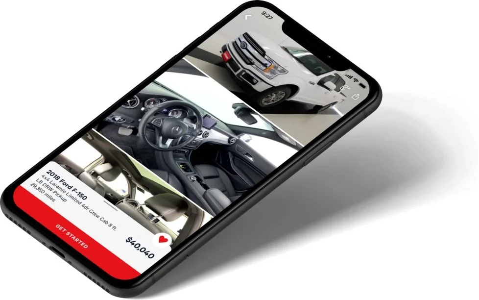
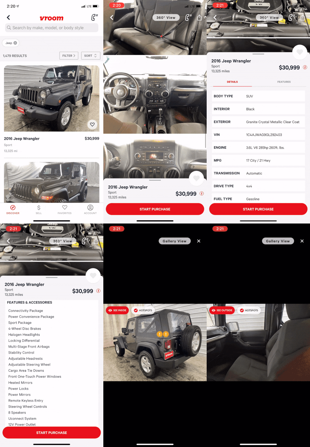
Taking inspiration from other image heavy apps, the first step was to make the images the main focus of the page, with the most important information about the vehicle (name, price, milage) being secondary.
The image section scrolls separately so that users can save their place in the images while they view other information about the vehicle. The images also show the defect photos inline with tags describing the defects. This design calls out the defects but does not make the user feel like the vehicle is too used.
We also stripped out information in the details section that was less interesting to users according to our research.
Reactions
We received a lot of positive feedback from the company as well as from users after conducting some scrappy usability tests after we released the new design. The new features we needed to include were also more easily accessible on the native apps vs how the design was completed on the web, so we saw positive results from watching users in Fullstory complete the search process. Introducing these features also meant less customer complaints and customer returns in the long run.
Next Steps
While we saw positive results from adding the features, the team still struggled with keeping users engaged in the apps. Some of the next tasks we went after were:
Adding push notifications for cars that were similar to what users had been viewing and liking
A brand new home page for the apps to help direct users in their shopping process
Developing features that utilized the phone itself, not just porting features from web

